Using the power of one to empower your brand and team
“One ring to rule them all,” right? The power of one in our fast-moving digital age of “many” and “multi” (- purpose, -tasking, -user, whew!) can’t be denied.
When it comes to businesses, the power of one is even more effective: Externally, it means one voice, one definitive aesthetic, one logo, one consensus, one mission.
Internally, the power of “one” can zoom in from that macro picture, taking you to the micro-decisions and functions that are required to maintain that purpose, vision and service.
From a singular brand formatting guide, to a specific template for project proposals, to relying on just one dashboard for an entire suite of functions, focusing on doing “one” thing at a time, using just “one” platform, or harnessing one type of document for a specific purpose helps everyone breathe easier and stay focused.
To maintain one look and feel, you’ll need to create a structure that can be used again and again. The details can differ but its purpose must remain.
In this example, we look at the essentials of business flyer designs: the elements that make it effective and the choices you’ll have to make only once before setting it as a reusable template for others in your business to use on the fly.
Building authority
Think of building flyer templates, infographic designs or even social media graphics as a three-fold exercise. You’ll be making the most important decisions here, up front, and each part builds on the previous.
It also gets easier as you go along.
Deciding on function
Answer these important questions to determine function:
Who is the intended end user/reader/consumer of this piece of content?
What are we trying to communicate here and what is the desired action this document needs to elicit?
What kinds of deadlines are usually in place when it comes to this kind of document (hint: this question is important because an “invoice” usually differs in delivery time and urgency from a sales deck. Deciding urgency will tell you how many parts of the document to keep “standard” and which parts can be edited).
Which teams will be accessing this document and what is their skill level or knowledge with design?
Deciding on structure
The structure of business flyer templates can be a mix of priority of communication and brand flourishes.
This means that there should be equal weight given to structural elements like graphics, containers for texts, flow of information as well as logos, motifs and borders that separate flyer designs for a campaign versus designs for a presentation.
You’ll also want to consider file format at this point: Should it be a graphic extension such as a .PNG or .JPG or would a PDF file serve better?
Deciding on layout
Depending on the function and structure, your next move will be to create a staple layout. That’s why asking those decision-making questions was initially so important: Layouts for documents should be based on who the end user of the content is and what the brand’s intentions are with its communication.
Determining layouts requires consideration of how much text will be on the page, versus how many graphics? What type of graphics does the document call for? How many text boxes will the template include? Will the heading remain static always or prone to change?
One more thing: Layouts for documents or even websites sometimes also take into account A/B testing and user persona’s. Why? Because, even flyer templates can (and should) be a responsive piece of content that is being continually improved based on user actions and interactions.
This means that a flyer designs aimed at an investor for a new product will include a different mix of graphics and text – perhaps using forms of data visualization like charts or profits – versus designs that are aimed at an end consumer, which would take its mix of graphics and text and use persuasion via benefits and features or testimonials.
Communicating consistency – consistently
Consistency doesn’t only embellish brand authority, it also builds trust in the end consumer. Remember, it takes, on average, seven interactions before your potential lead turns from “cold” to even knowing about your existence.
So make every interaction count by fulfilling expectations.
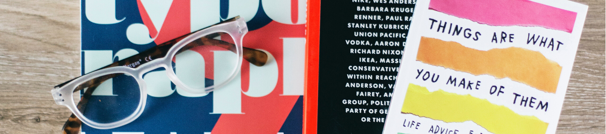
Aesthetic concern 1: Fonts
Keep a mix of one or two fonts, preferably a serf and a sans serif. You could, of course, focus on script/handwritten graphic font for headings versus a serif or sans serif for “paragraph” text, especially if they’re a part of a larger logo and aesthetic.
Think about the placement of the fonts on the page and use stylized headings to break up the text boxes, add some drama and contrast and even hit home your brand’s motto.
Aesthetic concern 1: Language & tone
Did you know that Apple’s Genius Bar and customer service has their own “language” guide, as part of their training and operations manual?
There are only particular words and phrases they are allowed to use, based on a bevy of focus-group testing and behind-the-scenes, expert message curating.
If your flyer templates leave room for ad-libbing content, make sure each user knows or can easily access the documentation that outlines what the tone or the language appropriate for each kind of template is.
Aesthetic concern 1: Graphics and photos
Some templates will maintain a standard photo (changed, perhaps, seasonally), while others will require the supplementation of a photo or graphic to be used.
If you’re relying on team members and employees to flex their creativity and choose a photo, make sure to have a ready-made library of photos for them to access or a vetted and designated, license-free website they can pull from.
From “DIY” to “P’n’P”
That’s “plug and play”, for those not in the know. The very last aspect to determine when formulating effective infographics, social media templates or even marketing flyers is to “audit” your template using these questions.
The answers to these considerations will help you understand whether certain parts of your template need to be automated, whether a completed template will need one more level of authorization before going live and how much training or information you’ll need to give employees in advance.
Is it accessible to all?
Accessibility to the document is so often overlooked, we thought it should be a part of the overall document.
After all, what good is it if you can’t find it?
Make sure that the completed template is readily available and accessible, as well as editable, on a platform everyone has the authority or permission to be on.
Can you collaborate with minimal clutter?
“Clutter” means everything from granting role-based access to having easily accessible libraries for supporting documents and graphics, to having version control built in to the software.
The bottom line is that team members should be able to take charge of these templates and create beautiful, professional, brand-centric documents every time. No exceptions.
Is it evergreen?
If a template is going to go down in history as the “master” or the “one” document to rely on and use when sending out or communicating, it must have elements that will be evergreen.
This means that, as part of the design, certain components are simply locked and taken for granted. There should be a balance: make too much “locked”, and you’ll take away creativity and visual difference. Give away too much and you’ll risk creating chaos.
Why does maintaining “one” look matter? In the everyday minutiae, having just “one” look or feel cuts down on the need to make the same decisions over and over again. It can mean empowering team members and employees to do things like create infographics or presentation decks based on a pre-made, pre-vetted template.
On a broad strokes level, maintaining the sense of “one” exacerbates cohesion into unity. Yes, documents are easier to find and faster than ever to create. But it also means less of a learning curve for integrating new pieces of software, less confusion, greater expectation from an end client or consumer and greater consistency in meeting that expectation.
Sign up to Xara for a free trial


 No credit card or phone number required.